Design plays a huge role in the digital landscape and can help even the smallest business stand out from the pack. We all know brands who have used clever creative to grow not only a massive online presence and following but also the business itself.
But good design (really good design) needs a clear vision and commitment to get the best outcomes. So what is good design? And how can your business use it to create a stand-out brand and successful business?
Here are a few 2018 design trends that are making waves in the design world but, if done right, are really effective for small and medium-sized businesses.
Animation and User Interface Interactions
Bringing online content and user interactions to life through the use of motion is a trend that continues to have a huge impact on website engagement without being too expensive to produce.
Elements like animated logos, icons, buttons and other interface elements, scrolling backgrounds or key visuals all contribute to making your website more engaging, improving user experience and lowering bounce rates.
Benefits of Animation
- Bring your website to life through the use of motion
- Further enhance your brand
- Enhance your website UX and UI
- Increase your capacity for storytelling
- Create engaging content
- Feedback from interactions provides an instant psychological reward
Custom Illustration
The custom illustration trend is becoming more prominent year by year as businesses look for ways to stand out from the pack and enhance their brand’s online presence.
Unfortunately, many websites rely heavily on stock imagery to tell their story and to add visual interest. And unless businesses have a big budget for premium stock or custom photography, they’ll probably resort to standard stock photography by platforms like istock and Shutterstock and end up with a mish-mash of cliché images that websites all over the internet have used as well. You know the ones!
This is where illustration can really set you apart – you have the ability to create a unique style and tailor your content to match your needs and narrative. Plus, it’s a lot of fun!
Benefits of Custom Illustration
- Customise your look – match your brand style, messaging, tone or content
- Be unique – stand out from the pack
- Bring out your brand’s personality
- Add high-impact visual interest

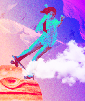
Brave, Bright, Vibrant and Gradient Colours
In part a response to the flat, minimalist design trends of a few years ago, designers have recently brought more personality, flair, emotion and visual interest to the online world through the use of bright colours and gradients. Why? Bold colours and gradients produce rich user interfaces and exciting user experiences – and can be used to punctuate certain areas of your website to draw attention to an important button or story element.
Vibrant colours are fantastic at creating a particular tone, mood or vibe – happy, dark edgy, techy, young, vibrant, creative...you name it.
Colours are a web designer’s best friend and being brave with the use of colour will hold viewers’ attention for longer, convey messages with more kapow and ultimately be more memorable. It’s important not to scare viewers away with unruly colour use, though, so make sure it’s still easy for people to read and consume your content. Get a good understanding of complementary colours and accessibility requirements.
Benefits of Using Bold Colour in Design
- Increase visual interest
- Increase impact
- Retain viewers’ attention for longer
- Use colour to trigger certain emotions
- Enhance UX and UI

Duotone and Transparency
Duotone refers to the halftone reproduction of an image using the superimposition of one contrasting colour halftone over another colour halftone. Duotone (and transparency) can create an amazing, stylised photographic look in order to convey unity, trust, honesty and duality, among other things like innovation and contemporary thought.
Duotone and transparency, when combined with strong colours, can also be used to create visually striking websites.
These effects have become really useful for web designers as they allow for easier text integration (i.e. white text reads better on an image with a coloured filter over the top) and the ability to have greater control over colour has allowed for site-wide systematic colour palettes.
Benefits of Duotone and Transparency
- Create stylised looks
- Make your website visually striking
- Explore systematic colour palettes
- Get easier text integration

These are just a few of the current web design trends that the BueRock Digital team loves exploring in our web projects at the moment. Other elements such as creative typography, drop shadows and photo masking are also fun to play around with.
Whether you use some or all of them, these design principles are great for small businesses because they can really add value to your digital presence. Custom illustration and animation can obviously be incredibly costly but if done the right way can provide great value for money.
The key is to find the right style for your business needs and goals. And don’t be afraid to create your own trends! The most trendy are often the ones paving their own path.
Get in touch with BlueRock's brand and digital experts to see some of our web projects or if you’d like help to boost your brand.


